

Why we redesigned TreasurySpring
TreasurySpring's new visual identity, from its refined logo and colour palette to new typefaces, imagery and a clearer website, is designed to make the business easier to understand, navigate and trust as it grows.
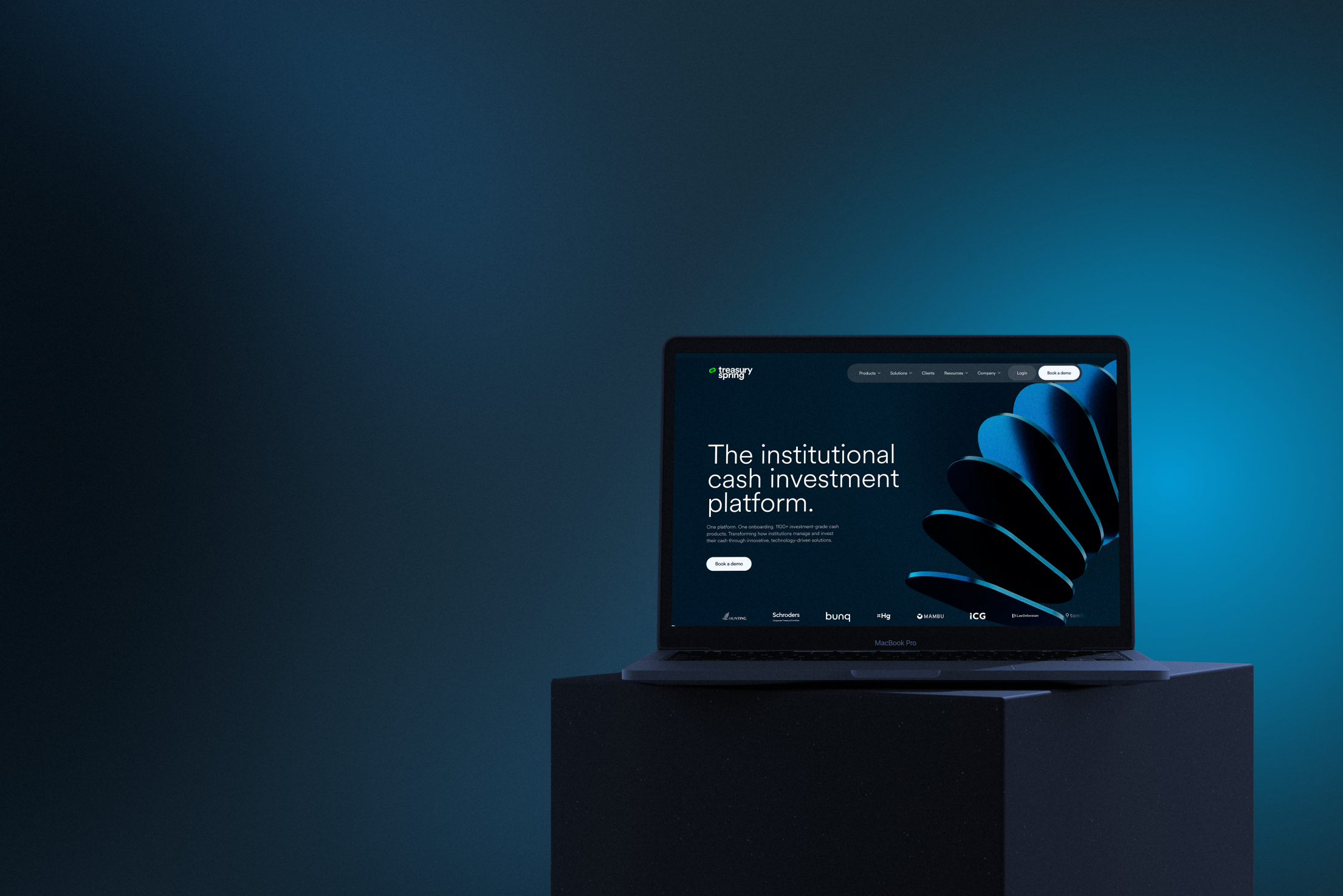
New colours. New typefaces. New imagery. A clearer website.
The best brand refreshes respond to a business need: making a company easier to understand, easier to navigate, and easier to trust.
That is what sits behind TreasurySpring’s new visual identity.
Our business has grown significantly, as has the range of institutions we serve and the ways they use our platform. Just over a year ago, we set out to build an identity and website that reflected who we are today, while making it simpler for clients and prospective clients to find the information that matters to them.
We have introduced a more cohesive visual hierarchy and refined the way typography, colour, imagery, and motion work together. These elements may sound aesthetic, but their purpose is practical: to distinguish the essential from the supporting detail and help readers understand where to focus.
The result is a clearer, crisper expression of what TreasurySpring does, who we serve, and how our platform helps institutions put cash to work securely.
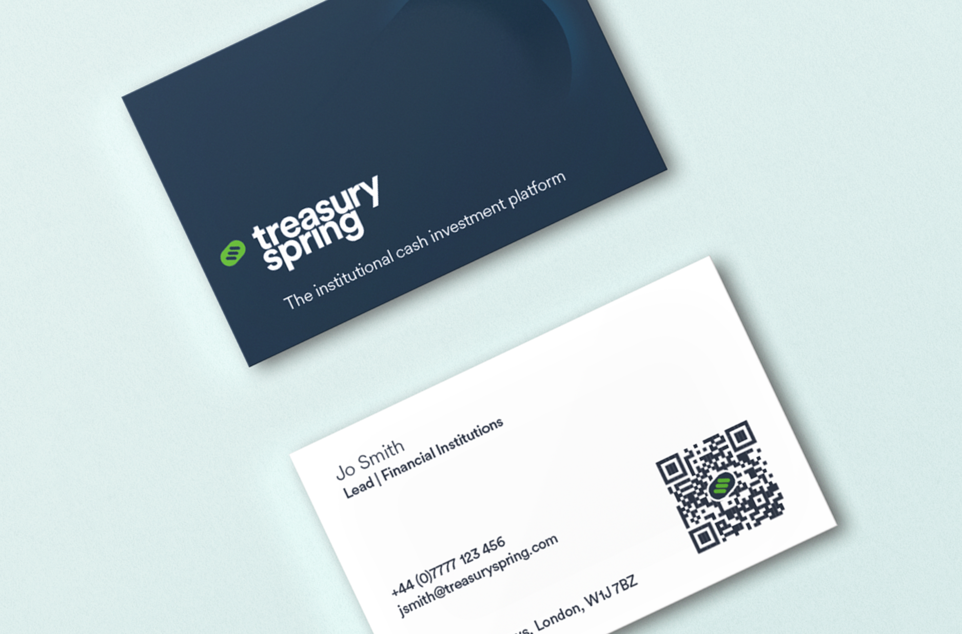
An identity that reflects the business behind it
Our previous identity served us well as a new market entrant. It was bright, bold, and deliberately different in a financial services world often dominated by greys and blues.
But TreasurySpring has evolved. We are now trusted by 1000+ institutions across sectors and geographies, offering access to a broad universe of investment-grade cash products through a single platform and onboarding process.
Our new identity is designed to reflect that progress. It combines the precision and discipline expected in institutional finance with the energy and ambition that have always defined TreasurySpring.
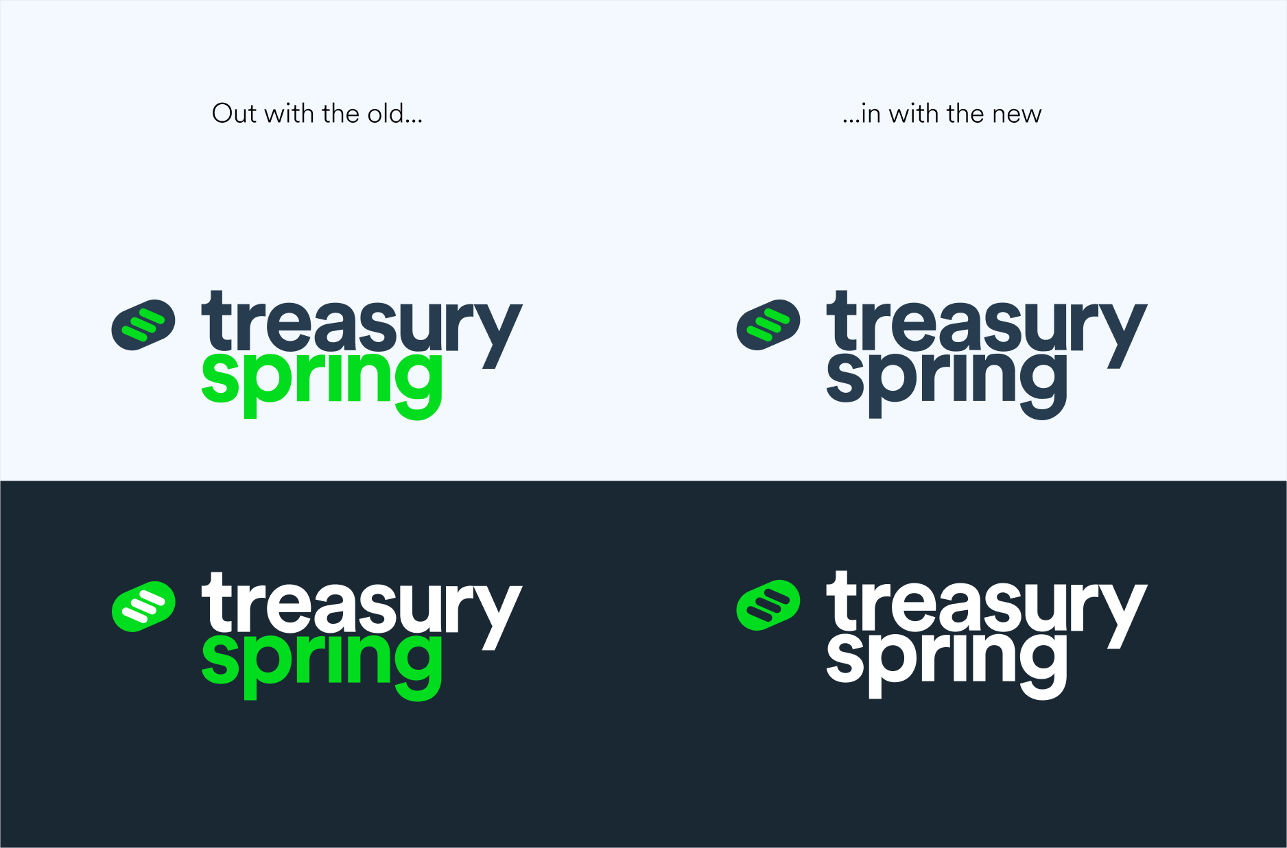
From logo to visual language
One of the most recognisable parts of our identity has always been the lozenge shape within the TreasurySpring logo. In the new design system, we have taken that familiar form and given it more depth, both visually and conceptually.
The icon in our logo sits at an angle of 23.5 degrees. This is the approximate tilt of the Earth’s axis, the angle that gives us the seasons and the conditions in which life can thrive. Within that outer form sit three smaller lozenges, representing security, liquidity, and yield: the three forces TreasurySpring works to bring into better balance for institutional cash investors.
The new 3D lozenges build on that idea. They modernise the brand mark while linking it more closely to our product. Each lozenge can be read as a visual metaphor for a Fixed-Term Fund: an individual investment wrapper, segregated, maturity-matched, and built around one underlying instrument. One counterparty. One term. One yield.
Used individually, the lozenge helps explain the clarity and structure of a single cash investment. Used together, the lozenges form a connected chain: a broader universe of products, counterparties, and terms made accessible through one platform.
That is the idea behind TreasurySpring itself. We have not simply aggregated what already existed. We have created an access layer that helps institutions invest cash securely, on their own terms.
Bringing balance to our colour palette
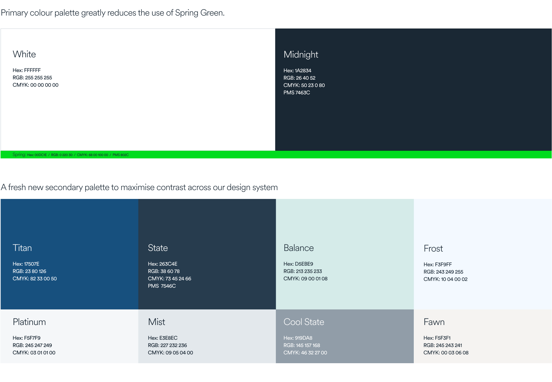
Our old visual identity built us strong brand equity. We stood out from the crowd. That’s why we have preserved many of the colours from our original palette. Blue suggests safety and trust. Grey implies maturity, balance, and logic. Our signature Spring Green brings something different: energy, ambition, and momentum.
But because it had been used so heavily, the green had lost some of its impact. It no longer fully reflected the sophisticated, institutional business TreasurySpring is today. So the task was not to remove the green. It was to give it more power.

Our new palette is built around rich dark navy, white, and more selective use of Spring Green as an accent. The result is a more confident institutional foundation, with our signature green used where it can do the most work: as a visual jolt, a cue for action, and a reminder of the relentless ambition at the heart of the brand.
Typography that creates clarity
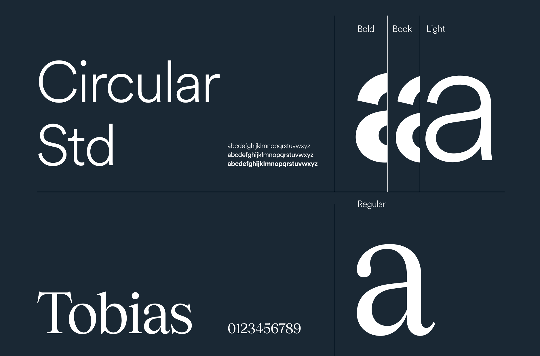
Our Circular typeface remains, but we have shifted from the larger-than-life weight of Circular Black to the quieter confidence of Circular Light.
We have paired it with Tobias, a serif typeface with high contrast between thick and thin strokes, designed to feel striking in larger formats. Tobias brings a more editorial, considered quality to the system, helping us balance institutional credibility with a sharper, more contemporary edge.
Together, the typefaces create a clearer hierarchy: helping readers distinguish headline ideas from supporting detail, and guiding the eye towards the information that matters most.
Imagery that avoids the obvious
Imagery across our communications has also been carefully considered.
TreasurySpring does not replace the treasury toolkit altogether. Our products extend access, broaden choice, and empower better decision-making. Imagery that shouted “disruption” or “change” would have undercut that proposition.
So we looked for images of structure rather than obvious pictures of finance.
Bridges were a natural starting point: both as firm foundations and connectors. Engineering details help suggest security and precision. Macro views of interchanges speak to global reach and movement. Pathways point to access and the ability to move forward.
We also explored convergence: the role TreasurySpring plays in bringing institutional investors and capital markets together. That led us towards reflections and architectural glass – separate buildings, institutions, and perspectives appearing together on a single surface. The reflected building becomes a meeting place, not physically, but visually and conceptually.
Good design reduces complexity
Treasury professionals make important decisions in an environment where clarity, accuracy, and speed matter. A website and design system serving that audience should respect their time.
That means explaining unfamiliar ideas without oversimplifying them, making detailed information easier to scan, and using visual communication to do some of the work that words otherwise have to carry.
Visual communication is not only about what is shown. It is also about what does not need to be explained in words. A diagram, a motion state, a product visual, or a structured page layout can often communicate a process or relationship faster than a paragraph can.
For a business like TreasurySpring, that matters. We operate in a category where the product can be technically complex, but the client need is simple: institutions want their cash to work harder without compromising how it is protected.
.png)
Designed for real working conditions
Treasury decisions are not always made from the same desk or device. Information might be reviewed between meetings, during a journey, or alongside several other systems.
The new website uses responsive layouts, stronger visual contrast, and more legible typography to create a consistent experience across screen sizes. It has also been developed with modern web and accessibility standards in mind.
Accessibility is not an optional design enhancement. It is part of communicating clearly. Readable text, logical page structures, and clear navigation benefit every visitor.
For existing clients, the new website creates a clearer window into the breadth of TreasurySpring’s capabilities. For organisations considering working with us, it makes the process of understanding our proposition more direct and transparent.
Built for where TreasurySpring is going
TreasurySpring is expanding its reach, developing its technology, and continuing to broaden access to institutional cash investments.
Our new visual system gives us a more flexible and consistent way to communicate across that growing business: from digital products and market insights to client conversations and new markets.
A new look should never be mistaken for a new coat of paint. Done well, it is an investment in comprehension, consistency, and trust.
Our appearance has changed. The belief at the centre of TreasurySpring has not: every institution, irrespective of size, sector or geography, should be able to invest its cash securely.
This refresh is designed to make that belief easier to see, understand, and act on.
*TreasurySpring’s blogs and commentaries are provided for general information purposes only, and do not constitute legal, investment or other advice.



Subscribe to Insights
Explore flexible, diversified funding, built around your requirements.